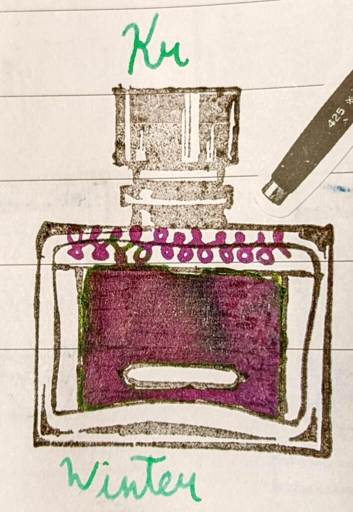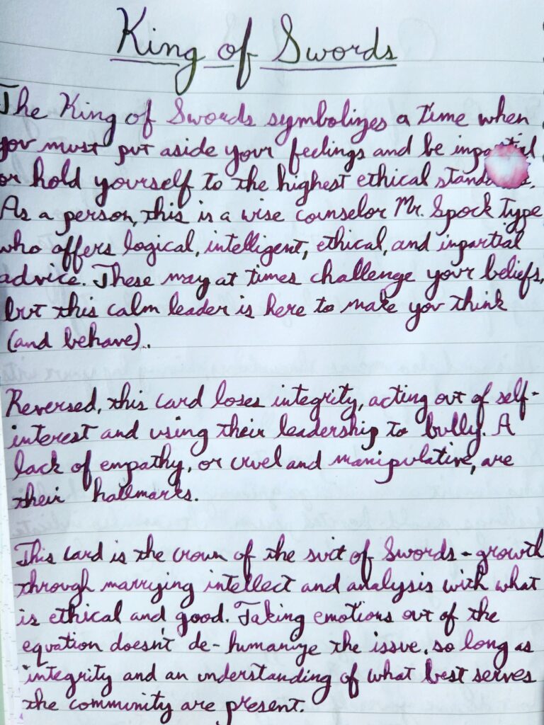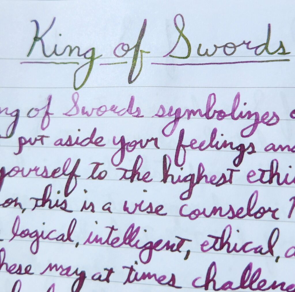
The above photo was taken in direct sunlight. Ink is swatched on Clairefontaine 90gsm paper, using a glass dip pen.
Specs
Name: Winter
Maker: Krishna
Color Family: Purple
Properties: Sheening
Gifted to me by my friend and ink enabler, Greg.
What’s in a name?
Apparently, there are three variations of Winter! I believe this is V2, given reviews I found on other ink sites. It’s part of the RC series, designed in small batches to have massive sheen. Although Krishna didn’t release information about the name, Ink & Colour has a guess and I feel like they’re onto something: Krishna inks are made in Kerala, India, which is home to the Neelakurunji flower, which blossoms (a close match for the ink’s hue of purple) every 12 years on the Western Ghats mountain range.

Swatches
A large swatch of ink showcases the darkest this ink gets, as well as the maximum properties it has (when held at the right angle to show any shimmer or sheen). But what about when you’re writing a letter or notes with it?


The above was written on Clairefontaine 90gsm paper, using a Click Majestic fountain pen with a Flex nib.
Of course, for maximum effect you want to see it in light and in motion. The following video shows the ink swatched on Skylab Letterpress 160gsm cards.

Thoughts
This was a nicely well-behaved ink, with a fun rosy hue and an elusive sheen.
My flex nibs deposit more ink than even my Broad nibs, so I’m not sure I’d be able to get any more sheen out of this ink, unless perhaps I was using a dip pen and being very heavy-handed. It’s also possible that Clairefontaine just isn’t the right paper to pop some sheen. I need to try this on Tomoe River (or Yamamoto Cosmo Air Light, if I can get more) to see if that shows up more.
Overall, this would be a fun one for letters, notes, and sketching, I think. It feels like a springtime and celebratory ink, given the saturation of color and also the depth of hue. Frankly, I enjoy contrasts (especially when a sheening ink isn’t just blue/pink or blue/red) so I’m pretty happy with this ink.
*All pics were taken using a Google Pixel 4a and color-adjusted to best reflect the hue of that ink.


Leave a Reply