
Violet Dreams by Robert Oster
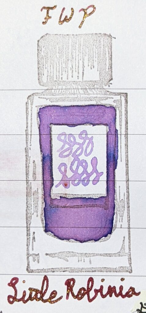
Overall, this slightly red-toned purple is a lovely hue, though better for letters and sketching than business use, with that shimmer.
Overall, this slightly red-toned purple is a lovely hue, though better for letters and sketching than business use, with that shimmer.

I know logically this ink has a sheen, but for the life of me I can’t find it. Not in the writing, anyway!
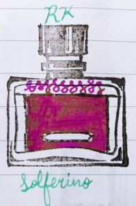
Do you like fuchsia? Then this is the ink for you. It’s intensely saturated and very well-behaved.
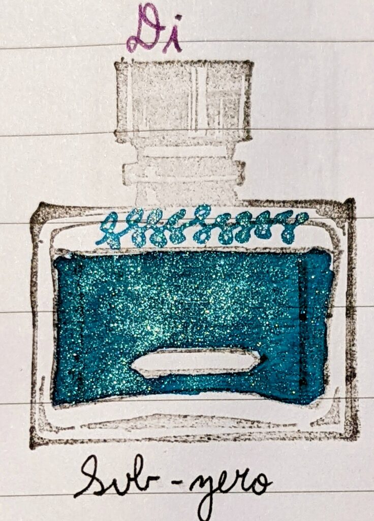
As a general fan of glacial/ice blue, and teal, I do love the teal-green shimmer overlay against the blue. It definitely feels icy to me, but also very fae. Winter Court, anyone?

It feels like a springtime and celebratory ink, given the saturation of color and also the depth of hue.

Snowflake is a well-behaved ink that is somehow always brighter than I expect it to be. It definitely shades, though the contrast between the darker shading strokes and the regular shading strokes is relatively low.
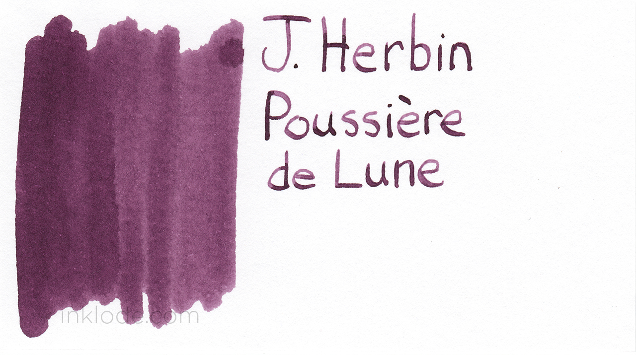
I thought it would be appropriate to post the review of this ‘moon dust’ ink on a full moon, so here we are.
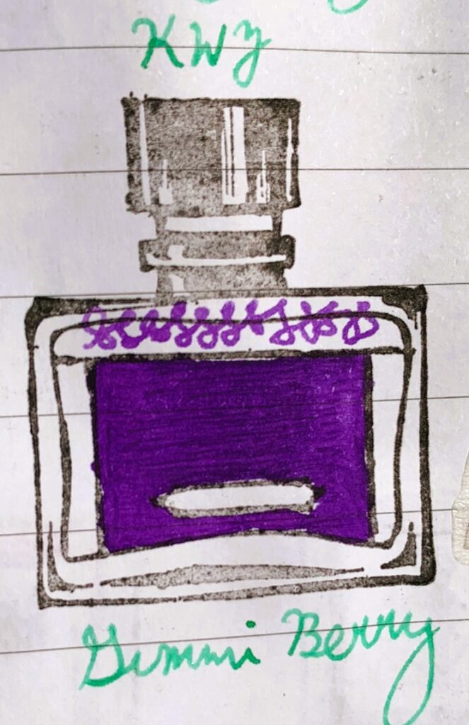
This is a Barney-purple ink. The name is ridiculous and calls to mind childhood sleepovers with too much candy.

This is a beautiful shading ink that really pops with chromatography. You can see the pinks and blues within it, almost like watercolor- but it’s dark enough to be legible.
OK, this is a very cool effect for an ink. The shading shows both purple and blue! The only downside is that it’s very light.