The above photo was taken in direct sunlight. Ink is swatched on Clairefontaine 90gsm paper, using a glass dip pen.
Specs
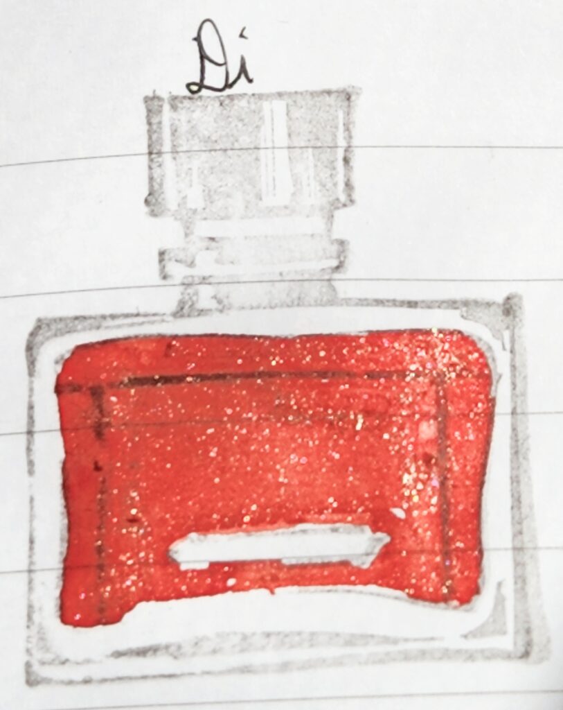
Name: Celebration
Maker: Diamine
Color Family: Pink
Properties: Shimmering
Purchased at: Atlas Stationers (came in the 2022 Diamine InkVent)
What’s in a name?
Like the vast majority of the Diamine InkVent colors (from all three years now), the name doesn’t really have a logical correspondence to the color. They’re often along holiday themes, like Garland or Holly, but after 50 holiday-themed names, it seems Diamine is leaning toward the more esoteric matches of name and color.

Swatches
A large swatch of ink showcases the darkest this ink gets, as well as the maximum properties it has (when held at the right angle to show any shimmer or sheen). But what about when you’re writing a letter or notes with it?


The above was written on Cosmo Air Light 75gsm paper, using a FPR Jaipur v1 fountain pen with a Flex nib.
Of course, for maximum effect you want to see it in light and in motion. The following video shows the ink swatched on Skylab Letterpress 160gsm cards.
Thoughts
So my Diamine InkVent came with a double of Cardinal, which bummed me out (I’m not a big red ink fan, and I was wondering what ink I was missing). I reached out to them and Atlas Stationers, and while Diamine steadfastly ignored me and then gave Atlas the runaround (boo), Atlas sent me the missing color (Atlas is a delightful, family-owned stationery store in Chicago and I highly recommend checking them out).
It’s interesting to me that last year’s InkVent had a color called Party Time, which was very pink and shimmering…and this time it’s Celebration, which is also a pink. Kind of.
It’s hard to classify this ink, because it writes (when wet) closer to the hue of salmon roe. That is, orange with a pink undertone. But it dries to a much lighter hue, more like a piggy pink. And it is filled with golden shimmer. With the use of a flex nib on this one, you can see the darkest this ink gets (in writing) as well as the most shimmer it can lay down. As with all shimmers, you need to gentle agitate the pen regularly while writing, to keep the shimmer flowing instead of clogging the feed channel. But wow, is there a lot of sparkle here.
It’s an unusual color, as fountain pen inks go. Not work appropriate, and might be too shimmertastic to use in art. But I think it will still be legible in a Medium nib, perhaps even a Fine nib (you’ll get less shimmer in a Fine, of course). I did get some railroading (again, could be the pen, as my FPR’s do that often), though for the most part this ink was well behaved. Dry time was a little longer than usual (7-10 minutes for me)- you will know when it’s more dry than wet, though, because of that hue change. Which is fascinating to watch. And beware that shimmer, which does transfer.
*All pics and vid were taken using a Samsung Galaxy S22 and color-adjusted to best reflect the hue of that ink.

Leave a Reply