
The above photo was taken in direct sunlight. Ink is swatched on Clairefontaine 90gsm paper, using a glass dip pen.
Specs
Name: Serendipity
Maker: Diamine
Color Family: Blue
Properties: Shimmering, Sheening
Purchased at: Atlas Stationers (came in the 2022 Diamine InkVent)
What’s in a name?
Like the vast majority of the Diamine InkVent colors (from all three years now), the name doesn’t really have a logical correspondence to the color. They’re often along holiday themes, like Garland or Holly, but after 50 holiday-themed names, it seems Diamine is leaning toward the more esoteric.

Swatches
A large swatch of ink showcases the darkest this ink gets, as well as the maximum properties it has (when held at the right angle to show any shimmer or sheen). But what about when you’re writing a letter or notes with it?
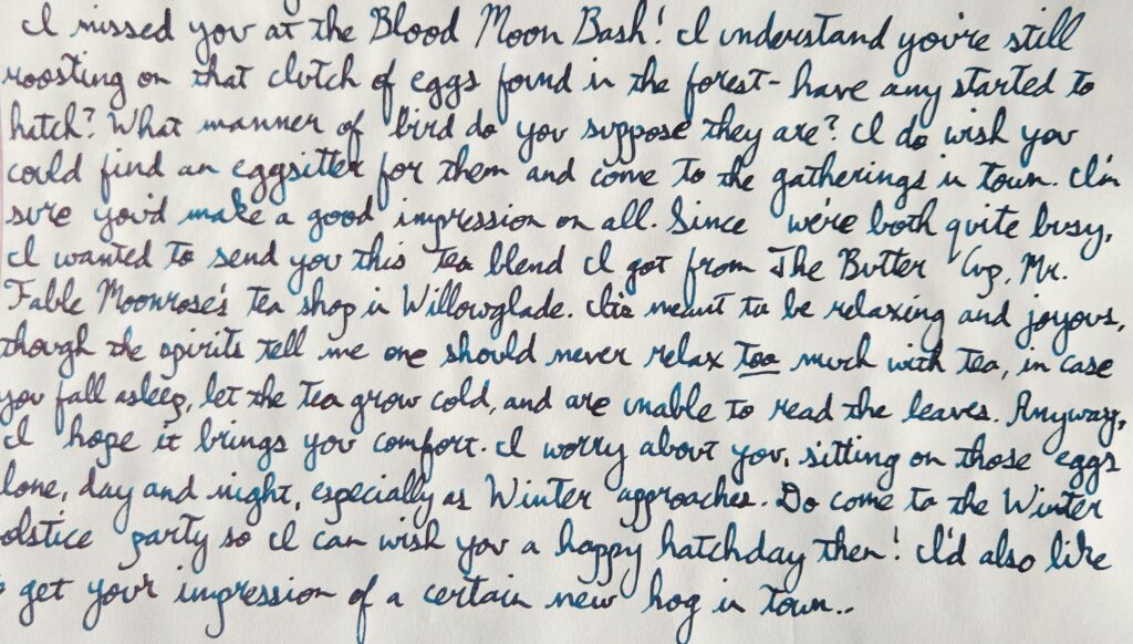
The above was written on Tomoe River 68gsm paper, using a TWSBI Eco-T fountain pen with a Stub nib.
Of course, for maximum effect you want to see it in light and in motion. The following video shows the ink swatched on Skylab Letterpress 160gsm cards.
Thoughts
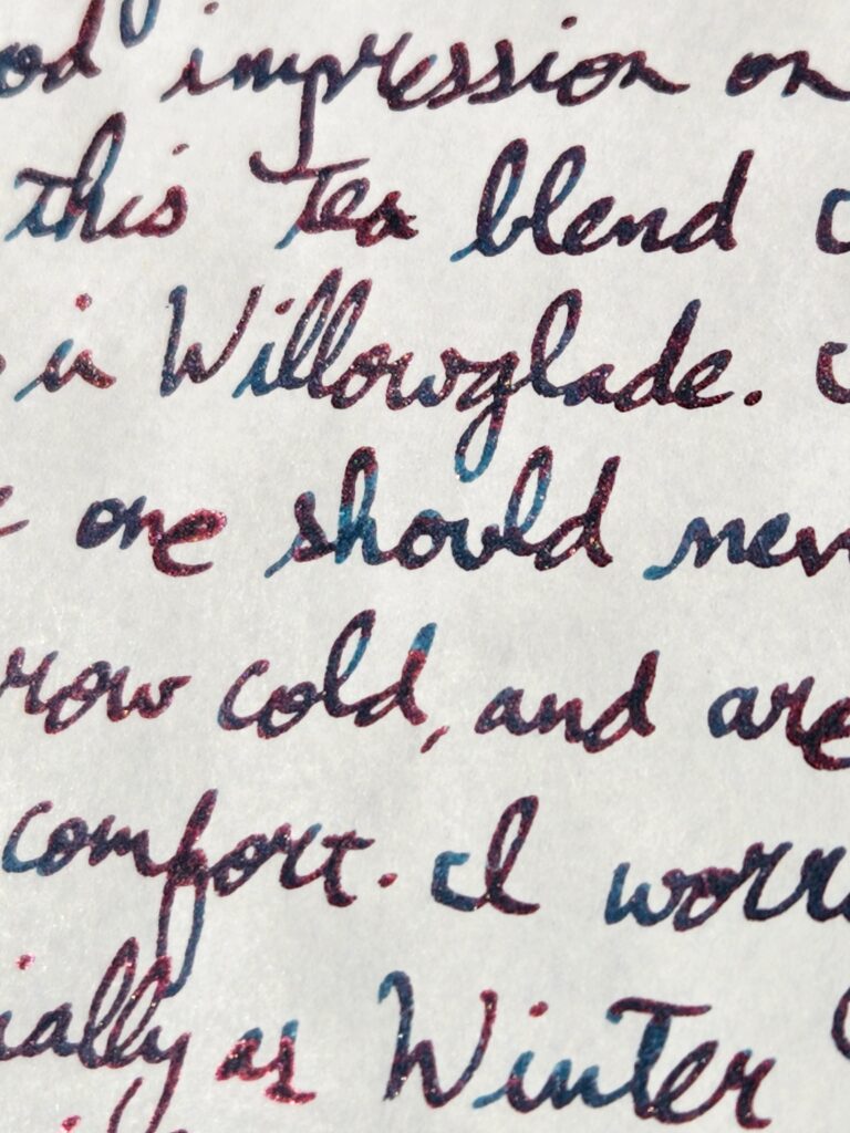
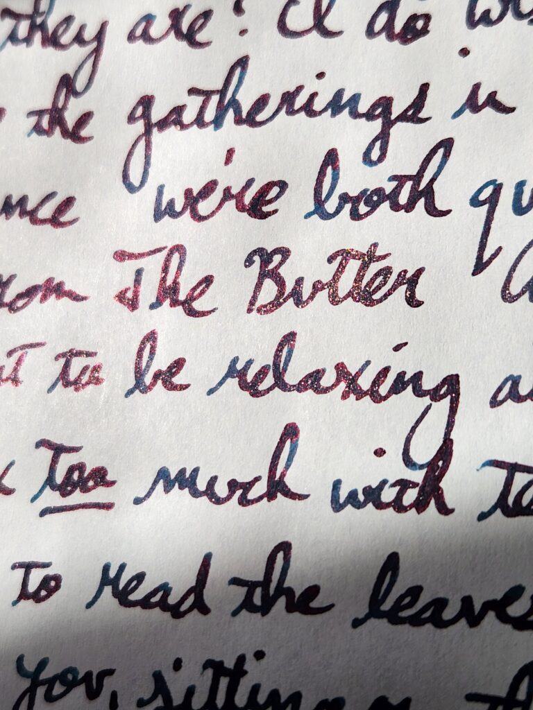
This ink is wetter than I expected, and it also sheens pretty immediately. It does take some time to fully dry, but I’m tempted to call it a monster sheener for how much sheen pops in almost every stroke. Far more sheen shows up than shimmer! And the red sheen over the base blue ink has that galactic effect where at certain angles it looks black and at other angles it’s a metallic red.
Despite being over blue inks that sheen red or pink (which honestly has been done to death, by every ink brand), this is a pretty ink and would certainly be a great choice for invitations and announcements.
*All pics and vid were taken using a Samsung Galaxy S22 and color-adjusted to best reflect the hue of that ink.

Leave a Reply